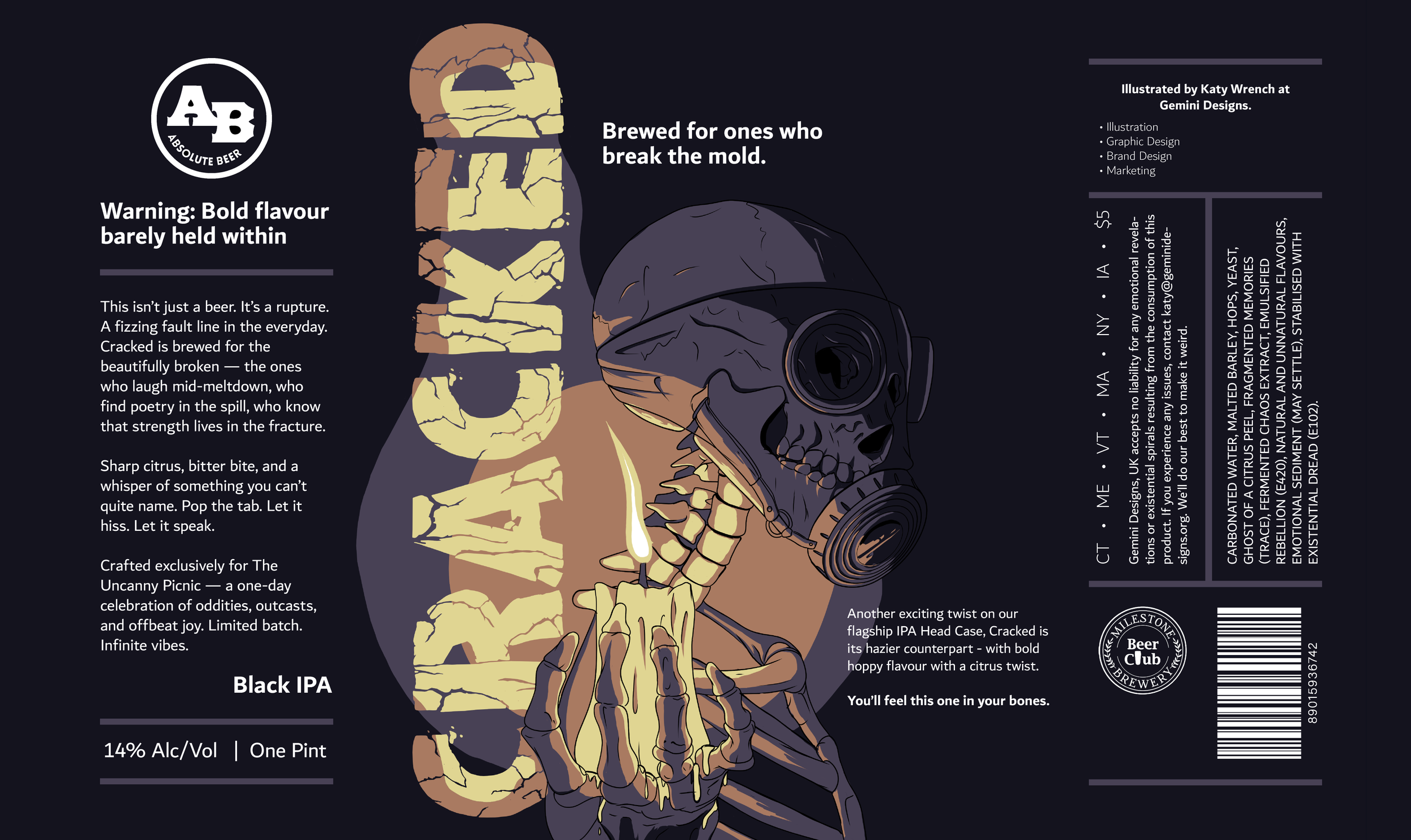
Cracked
Concept beer brand packaging design - Edgy, bold, small batch crafted beer with punchy flavour.
This concept was very much about being cracked or damaged but still beautiful.
The gas mask (which would do nothing for a skeleton) symbolising the futility of hiding who you are when your truth is already visible. Beneath the surface, there’s nothing left to conceal. The candle represents the light in the dark and of hope, but also the shape language makes it look like a middle finger - this was very much intentional, and about being unapologetically yourself.
The candle is being handed towards the customer, the skeleton turned as if prepared to walk into the dark, the natural smile of a skeleton’s jaw gives a feeling of confidence and pride - a beckoning to join, and a handover of this message to pass forwards.

Sketch & Development
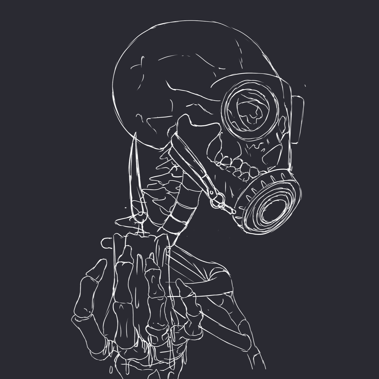
Sketch

Developed Linework

Flat colours
Colour testing

Contrast Test

Duo Tone Exploration - too much gradient

Tri-tone exploration with photoediting - created some really nice shapes but needed finessing for readability.

Hand created with 4 tones for better readability
Colour explorations of 4 -tone - too cold

Not bold enough to stand out on a shelf - over used tone of purple.

Too bold in tone, and brownish tone implies hops when it concept was more citrus
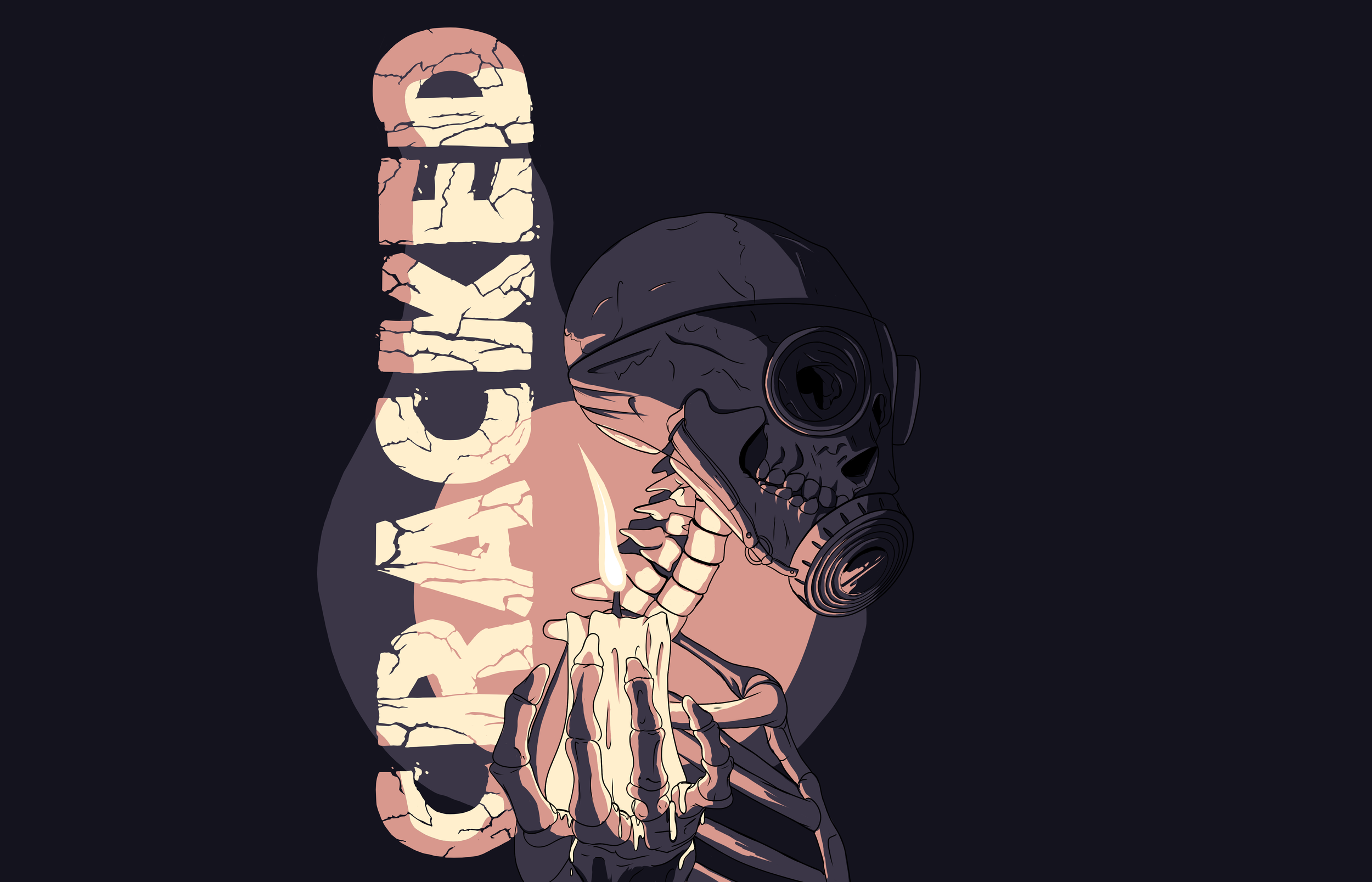
Chosen colourway - combines citrus with flame colours, has enough contrast and punch whilst highlighting the typography.
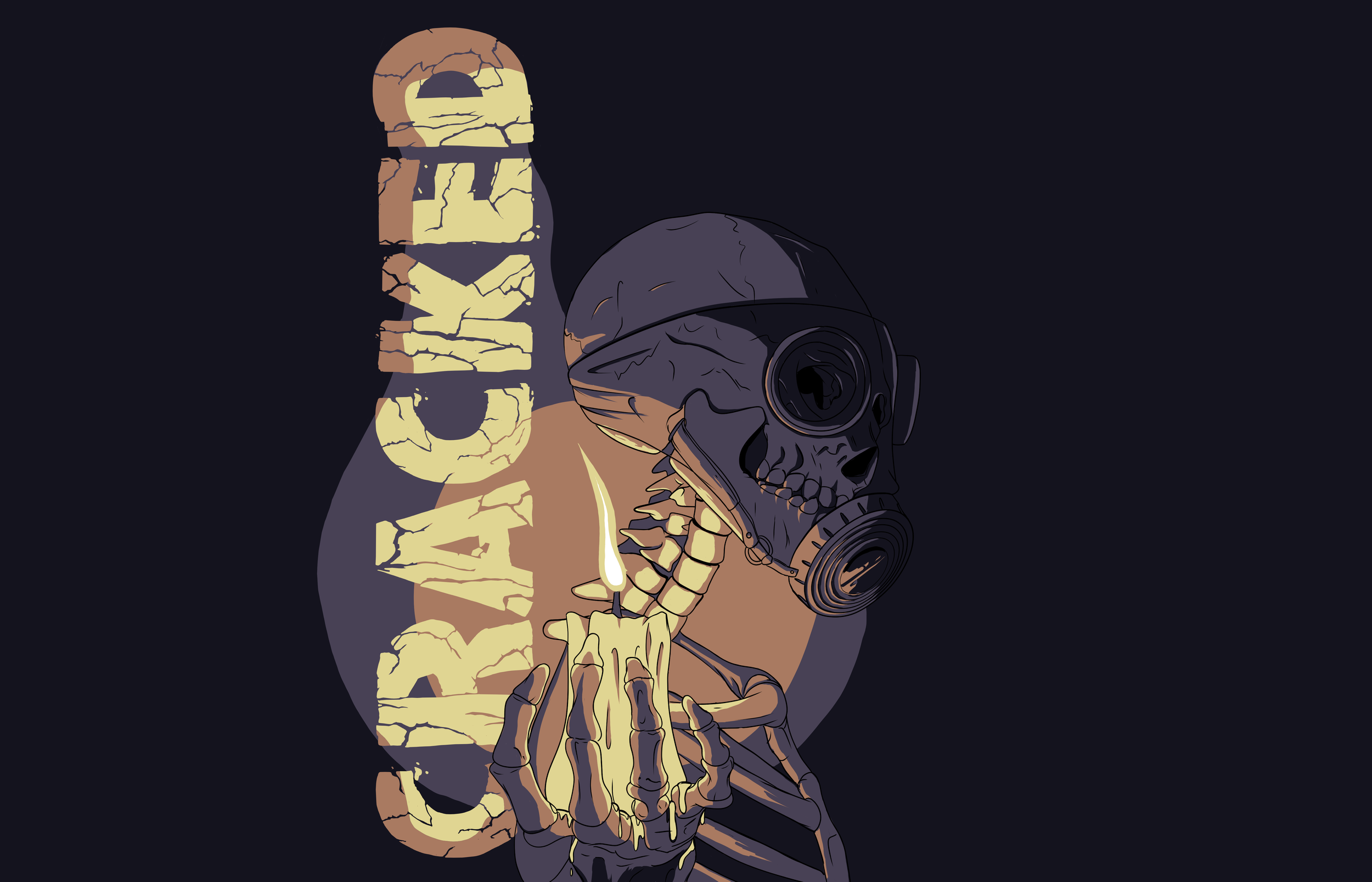
Contrast & Saturation Check

High contrast - type is readable and accessible, design flows, illustration is the hero.