Brand identity refresh for a Microsoft partner, Corporate Project Solutions (CPS).
The Goal: To look as established as their biggest competitors, while staying friendly, local, and people-first.
I led a full brand refresh that aligned their identity with core values of clarity, trust, and impact.
We created a system that’s accessible, engaging, and built to connect.

Project Summary
Role: Design Lead
Focus: Website and brand refresh
-
Refined brand messaging to sound warm, clear and human. I built out tone of voice guidelines for consistency across teams including an AI prompt system using Copilot to support internal workflows.
-
Client wanted to keep the pallet. I brightened the orange and blue palette for more energy and clarity and added more useable secondary colours.
-
Restructured the site for better flow and accessibility - focusing less on tech and more on solutions, building a more aspirational tone.
-
Set up a clean, flexible type system with clear hierarchy. Paired it with responsive grids to support modular layouts across web and print.
-
Designed simple, hand drawn illustrations to support the human side to the messaging. Kept line weight and colour style in sync with the wider brand.
-
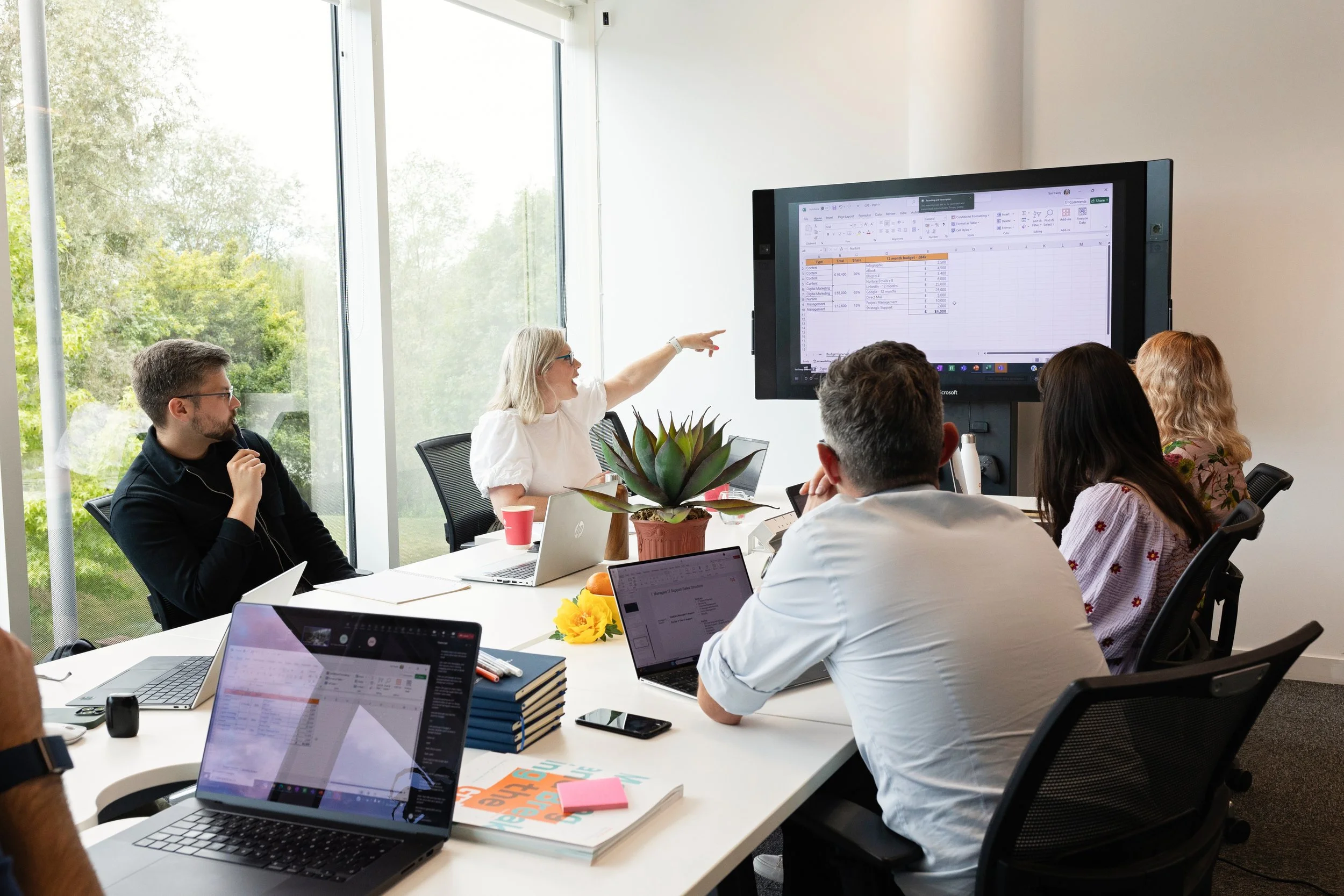
Directed a shoot with real team members to show personality and care. Worked around post-COVID challenges to build a strong, authentic image library.
-
Designed large-format posters and branded decks with bold layouts and clear messaging. Built templates that are easy to reuse and adapt.
-
Created a full set of brand rules—logo, colour, type, tone, accessibility.

Skip to Section

Core Message: Going beyond technology.
Because CPS doesn’t just implement Microsoft solutions—they help real people thrive. This widens the viewport and connects with the people that are using the software.
By making systems more intuitive and less frustrating, CPS empowers teams to work smarter, stay engaged, and deliver the essential services the UK relies on.
Hooking onto this frustration and dream of better is where the investments in new ways of working live.

Colour Scheme: Bold and modern
The existing orange and blue tones needed to stay. I brightened the palette to add energy and clarity, refining the hues for better contrast and accessibility.
The updated colours feel more modern and cohesive, while still honouring the brand’s legacy and recognisability.


Website Design
I designed and wrote over 80 pages for the new website. Following design protocol of gathering feedback and surveys, coming up with multiple prospective directions and combining the feedback together into a final.
“Katy's was perfect. They were able to provide insight in to how we could improve the use of our colour palette and associated approaches to graphics and images. Within weeks we had seen an improvement in engagement for our LinkedIn posts.
Katy was instrumental in creating the new CPS website, working with internal teams and an external agency who built the site from their designs.
Katy provided multiple options for how the site should look, taking input from people across CPS. It was great working with them and I would recommend them without hesitation.”
Christopher Pond - CTO, CPS.


Typography
Developed a consistent and easily accessible font combination that could also be used in graphics as a larger print.
Mont was neat, bold and unapologetic - the type of font that follows the business mojo.
Lato was very easy to read, without too much fussiness - perfect for accessibility. It was also very similar to Microsoft’s primary font so there was consistency in our materials.

Grid Systems
I created a grid system to ensure all our printed and presentation materials followed the same limited design style so that we had a consistent feel across all of our customer experiences. These were applied to the website as well.
Illustration
I developed a versatile collection of editable vector illustrations — designed for use across presentations, websites, and internal tools.
Dynamic Visuals
Arrows, circles, and motion cues were especially popular — used to transform static screenshots and dry text into something more human and intuitive.
Designed for Flexibility
Fully colour-editable and format-adaptable, the assets could be tailored to suit different brands and platforms.
Created with modular use in mind — from onboarding flows to pitch decks.
Office-Themed Icon Set
I also designed a suite of office-themed icons to support visual storytelling and simplify complex ideas.
These helped explain services, workflows, and team structures in a way that felt friendly and accessible.

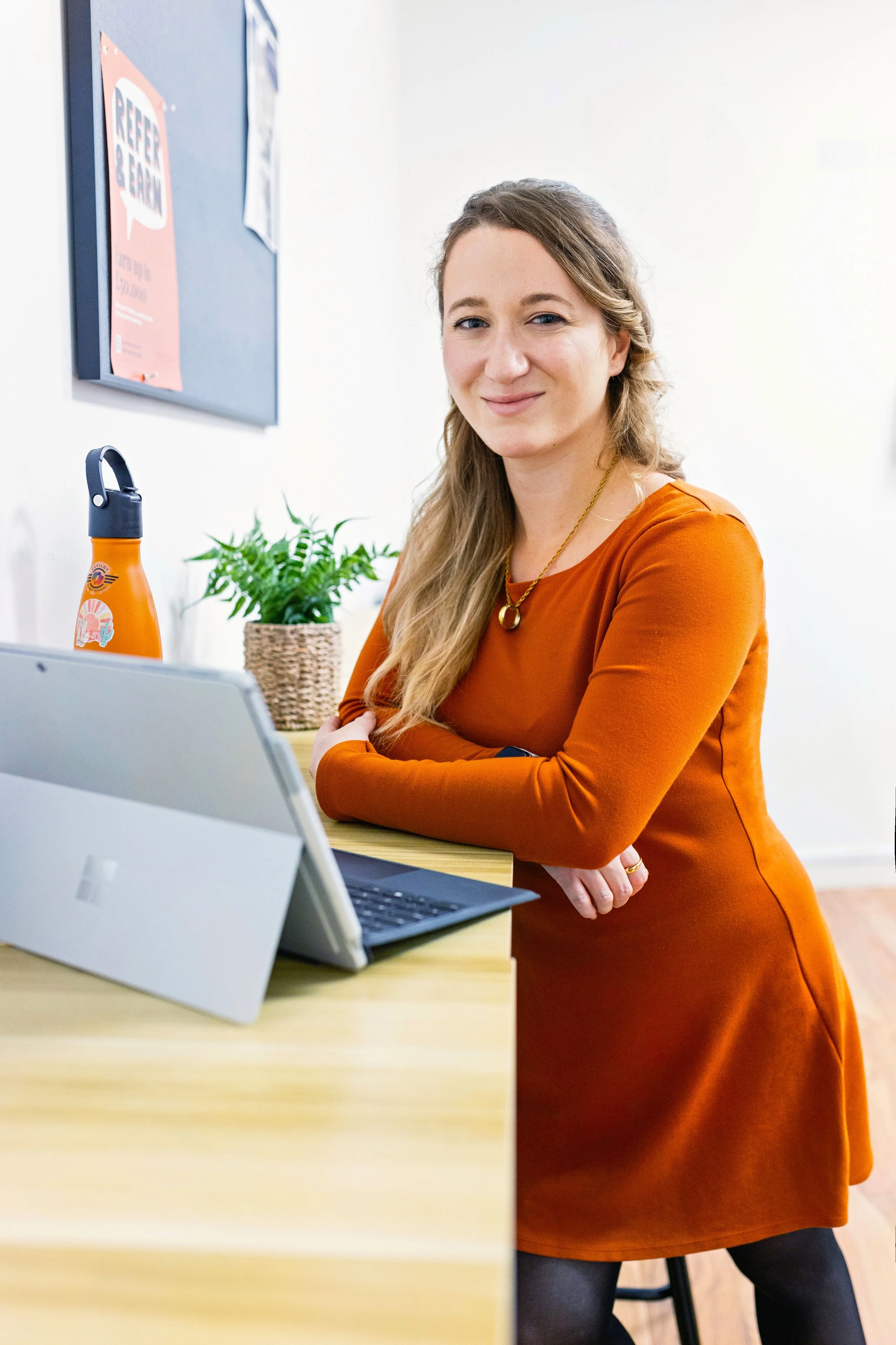
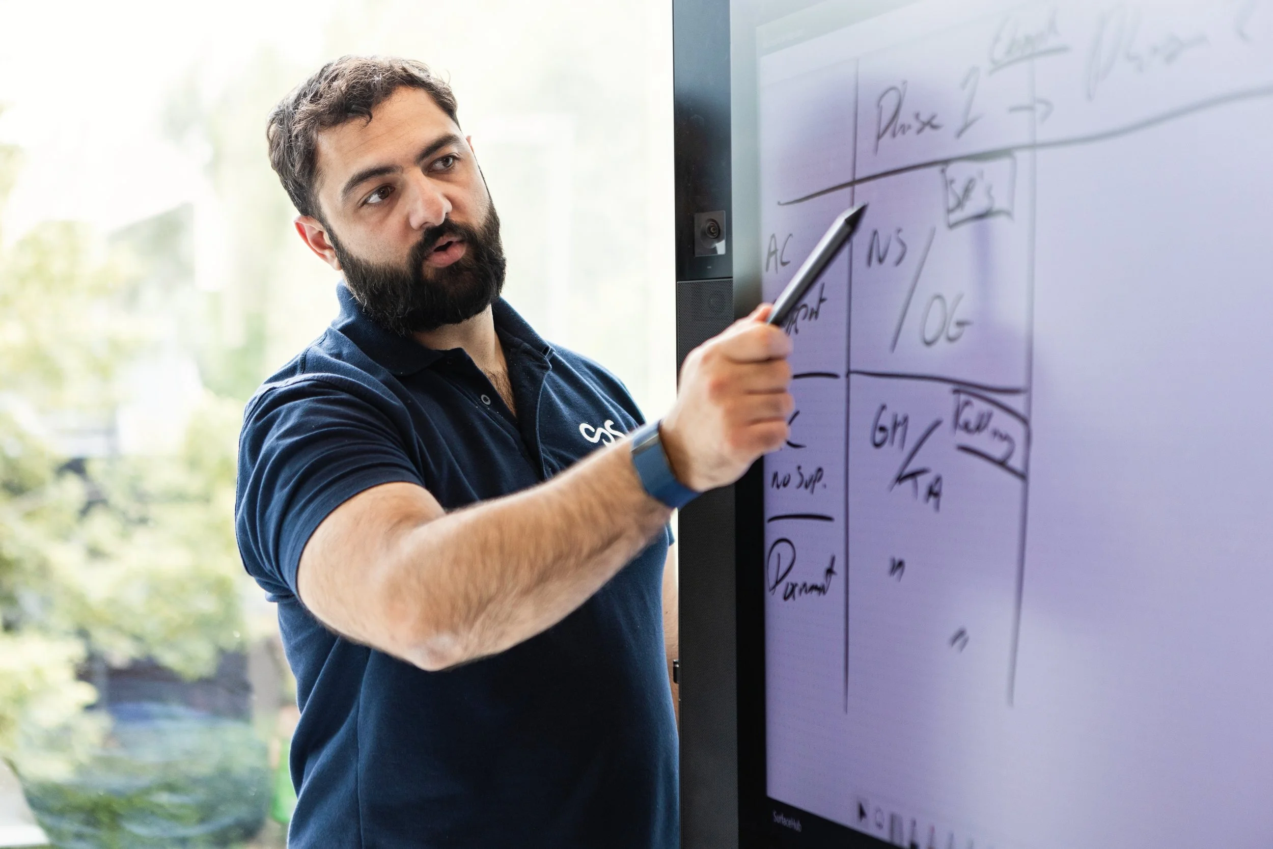
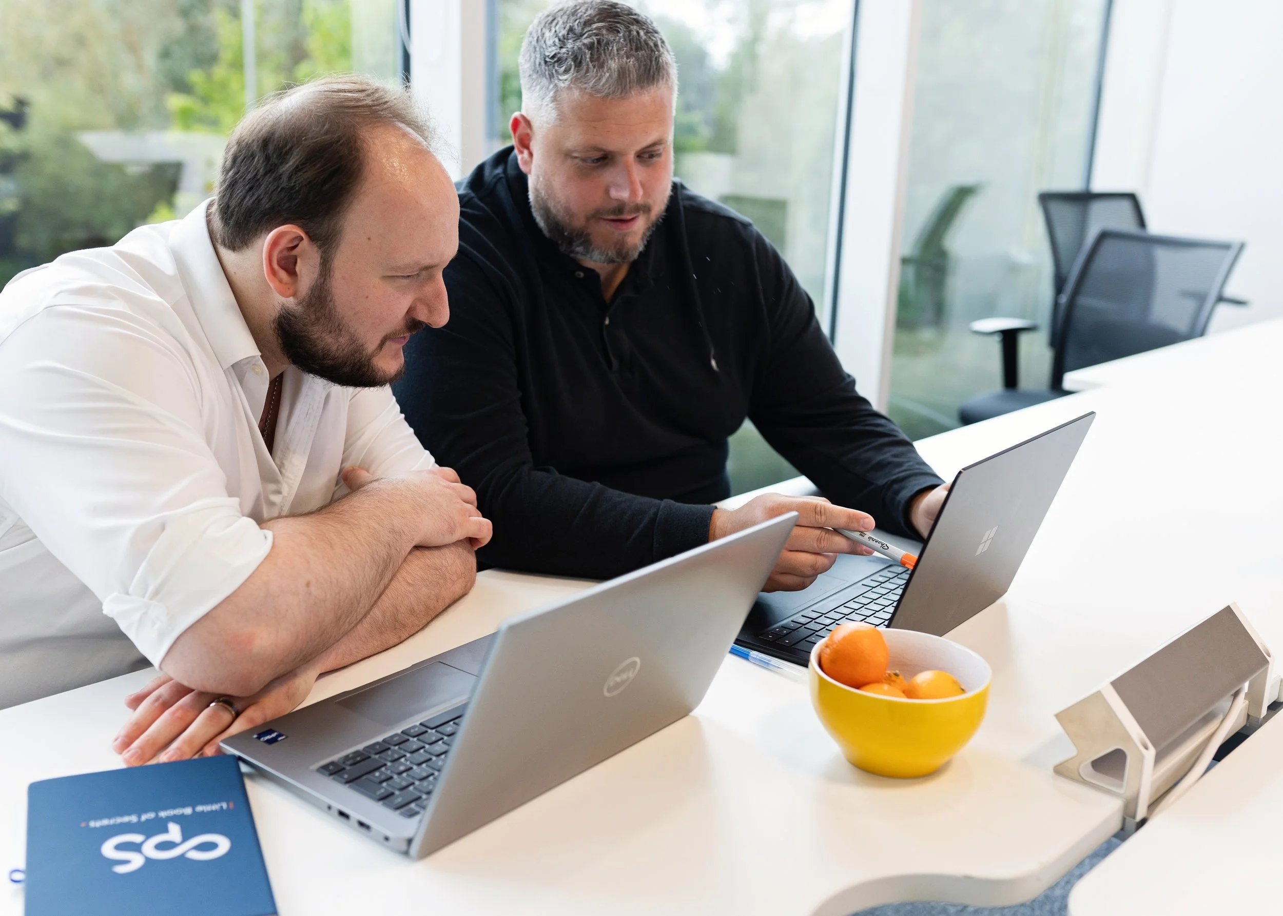
Bringing real people into the photography was essential to reflect CPS’s personality and genuine care. I collaborated with Veruschka Baudo—a trusted photographer I’ve worked with for years—to produce a wide selection of images that tied directly into the refreshed brand colours and identity.
While post-COVID hesitations made it challenging to gather volunteers for the shoot, we adapted creatively and captured moments that felt authentic, warm, and team-driven.
Photography


Large Print

I designed a variety of lightboxes and printed conference banners up to 8m wide which were widely celebrated across the company.
Presentation Design and Brand Guidelines

Developed comprehensive brand guidelines including pre-made AI prompts to ensure consistency across the business in style and tone.