Concept Project - Unite
Unite is a faux charitable organisation for the trans-community, bringing people together both online and offline into major city groups to organise networking, dating and friendship building. It would also work to share helpful resources for the community.
Unite is a conceptual design project showcasing my expertise in digital illustration, custom typography, and immersive layout design. Built around community, connection, and empowerment, it explores how design strengthens storytelling.
Key elements:
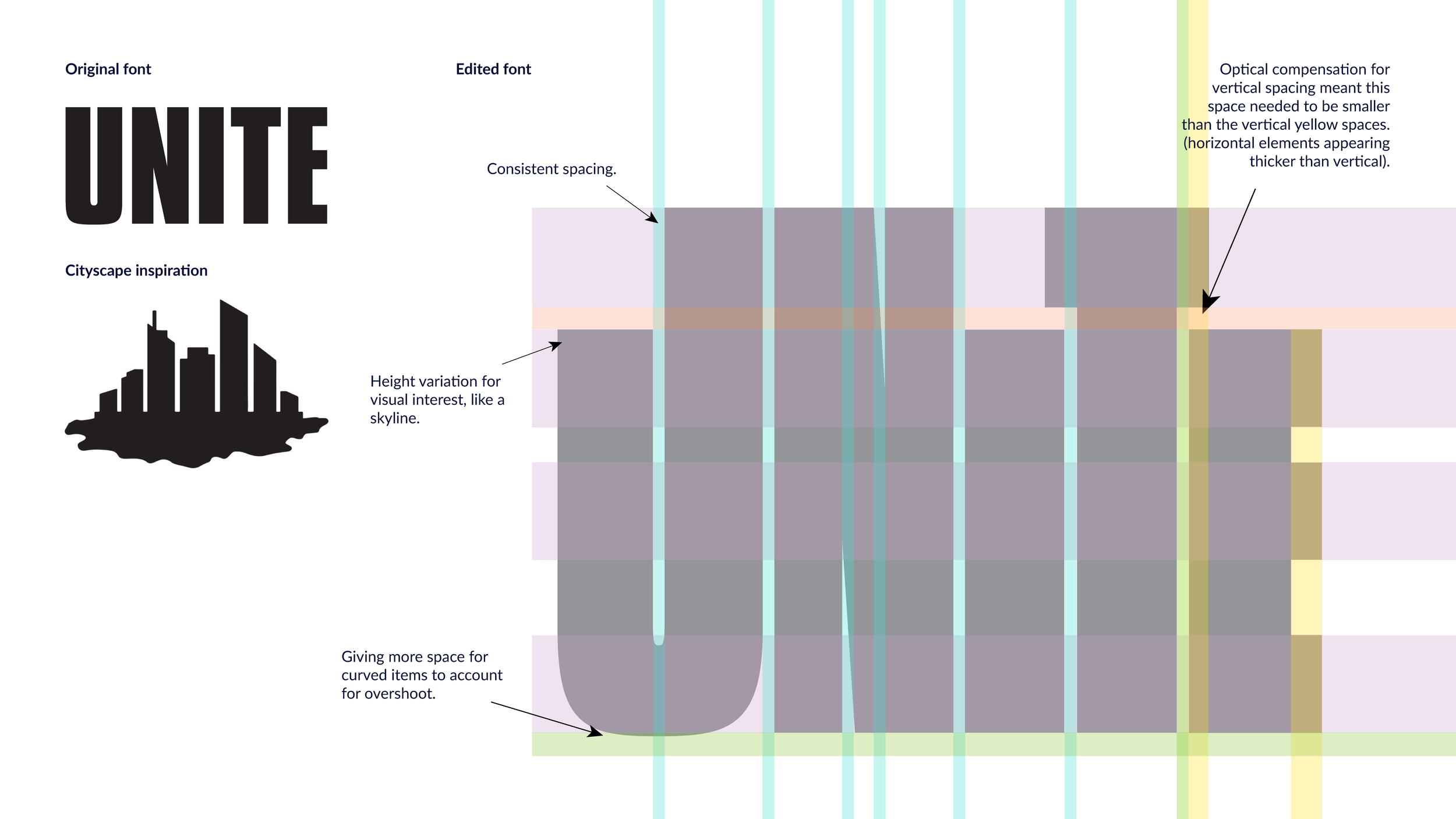
Typography resembling city buildings, symbolising interconnected communities.
Minimalist illustration of two people hugging, representing shared experiences.
Colour palette drawn from LGBTQIA+ flags, reinforcing visibility.
Affirmation pattern adding depth and resilience.
Designed as a bold, immersive homepage, Unite combines illustration, typography, purposeful colour schemes, and layout strategy into a cohesive digital concept.
Beyond design, I actively foster LGBTQIA+ communities, managing a Discord server and engaging in networking groups to build safe spaces.
Colour Scheme & Gradients


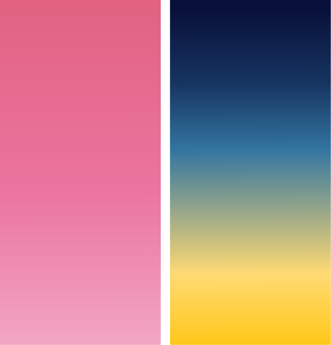

I chose pink, yellow, and blue to reflect a simplified gender spectrum — feminine, neutral, masculine — inspired by pride and gender flags. Together, they evoke a sunrise:
Hope in the yellow sun on the horizon
Defiance and love in bold pink
Rest and grounding in deep blue
Visual Strategy
Gradients soften transitions and unify the palette (wordplay intended).
Pink leads as the primary call to action — energetic, unapologetic.
Dark blue supports and stabilises.
Yellow adds warmth to secondary actions and graphic accents.
Illustration Approach
I’ve added lighter hues for stylised linework — ideal for inclusive representation. Linework lets us depict people without assumptions around race, gender, religion, or sexuality. It’s expressive, respectful, and keeps the focus on shared humanity.

The Embrace: Cornerstone of the Brand
A stylised illustration of closeness and care — this became the heart of the brand and the foundation for the logo, alongside the tagline ‘Lead with love.’ Not just aesthetic, but intentional: a symbol of connection, support, and emotional clarity.
Design Intent
Linework captures intimacy without assigning identity.
Viewers can project themselves into the scene.
Represents comfort, solidarity, and rest — free from assumptions around gender, race, or background.
Universality made it the perfect motif to evolve into a logo.
Logo Development
Abstracted into a minimal, symbolic form.
Circles = heads, curves = arms — echoing the original embrace.
Designed for flexibility: works across digital, print, social, and accessibility contexts.
Reflections
The logo is still evolving — but its emotional roots give it depth and clarity. It’s a visual shorthand for the brand’s values: Hope. Rest. Defiant compassion.
