Casa Del Cactus
Skills
UI Graphic Design
Brand and visual identity
Illustration
Cultural studies
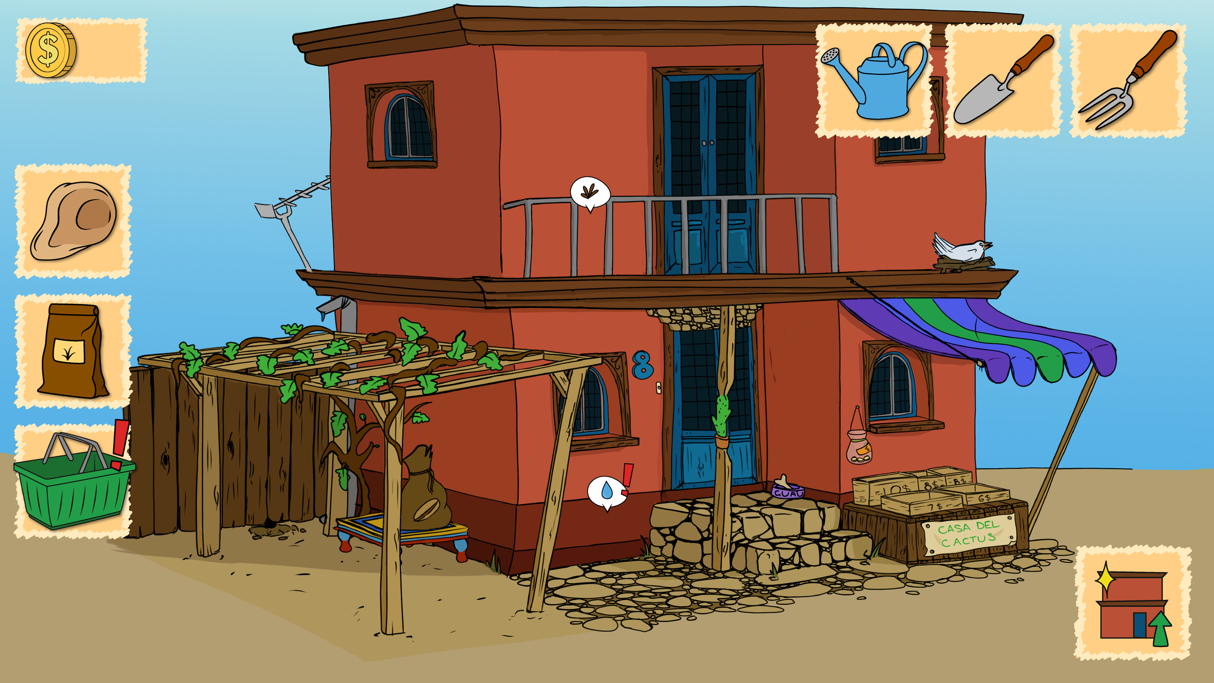
Casa Del Cactus was a 14-day game jam project made with a team of four. It’s a cozy cactus-growing game set outside a colourful Mexican home, where players grow and sell plants to passers-by.
I led the visual direction and UI design, making sure everything felt warm, clear, and culturally respectful. I spoke with a close Mexican friend about how games often flatten Mexican culture into rural poverty tropes—so we redesigned the bungalow into a proud two-story townhouse. The palette leans into sun-washed adobe, deep shadows, and playful saturation—not stereotypical, but still vibrant.
The UI is bold and simple. Icons are easy to read across languages, and speech bubbles from the plants use familiar symbols (exclamations, coins, water drops) so players know what they need without reading. Although Spanish speaking countries generally use inverted exclamation marks (¡) in writing, we thought that would be confusing for English speakers. It’s designed to be intuitive, friendly, and accessible—especially for international players.

House design first iteration
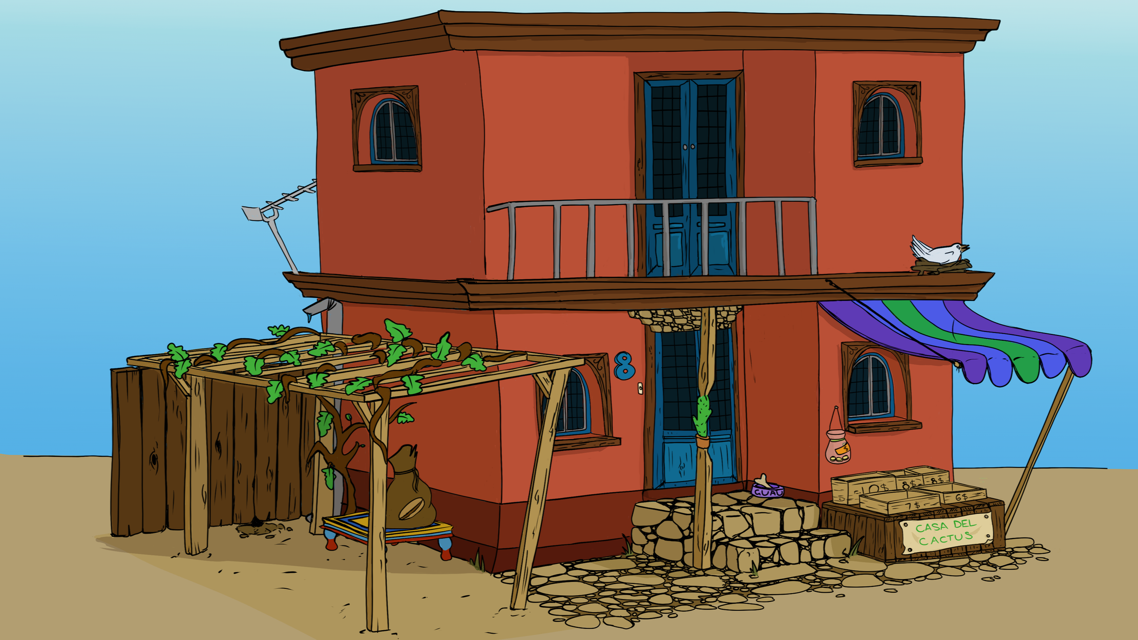
House design development - less stereotypical colour scheme, and looking more affluent as a two-story town house

Custom typography for the title screen including the main font used throughout the game.
UI designs included overlays for the items and resources in the game and the upgrading module

The shop had its own overlay. We wanted to use Spanish language but we were careful not to make it inaccessible to a global audience, so relied heavily on visual symbols.

Simple cactus designs each had their own colour scheme and shape language to differentiate the different types visually.
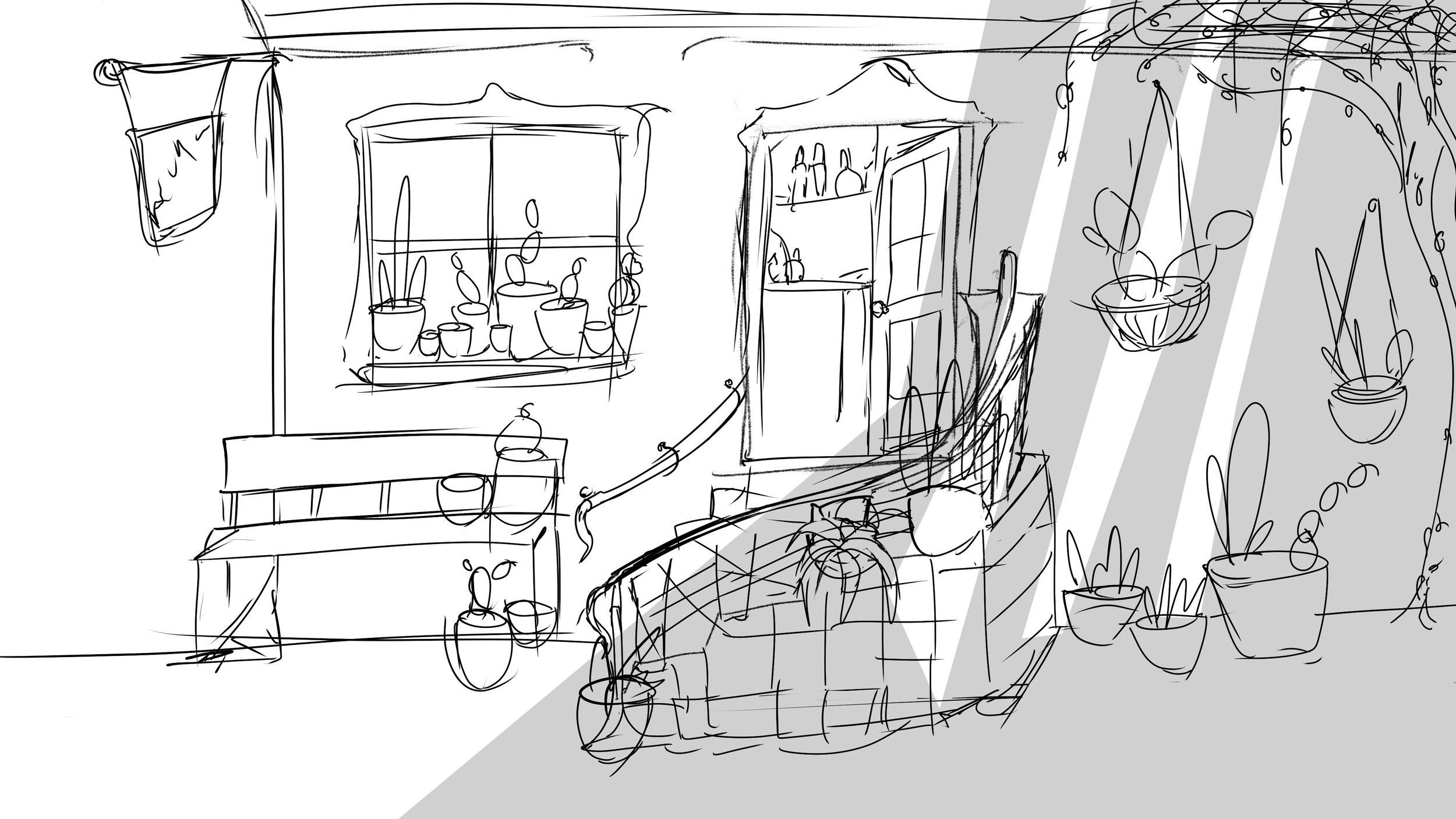
Initial design sketches

3D perspective drawing